Gutters and Borders: Where The Action Really Happens
So, here it is, the second installment in my series on ‘The Flow Of A Page.’ Last time we broke it down with panel layouts, both grid and free-form, and talked about ‘The Big Z,’ that is, bouncing the reader’s eye exactly where you want it to go across the page. This is a medium that should strive for, above all other things, clarity. You as the artist/writer/creator are trying to convey a message (story) that should be able to be digested by the reader without confusion or chaos. That’s not to say confusion and chaos can’t be used as effective elements as well, but that’s for another post. You’ve already learned some rudiments on panel layout, so now we will move on to the construction of panels, and that all-important space in between them, the gutter.
The artist has many subtle tools in the box for manipulation of time and space, even within the perceived limited confines of a simple comic page. By tweaking certain elements of the page such as gutter (the space between two panels), margin (the space at the edge of the page, usually buffered by some blank space), bleeds (breaking the margin and causing a panel to extend off of the page), and borders (the actual containment of a panel, traditionally a simple black line) the creator can remain in control of every element of that page, properly conveying their message to the reader.
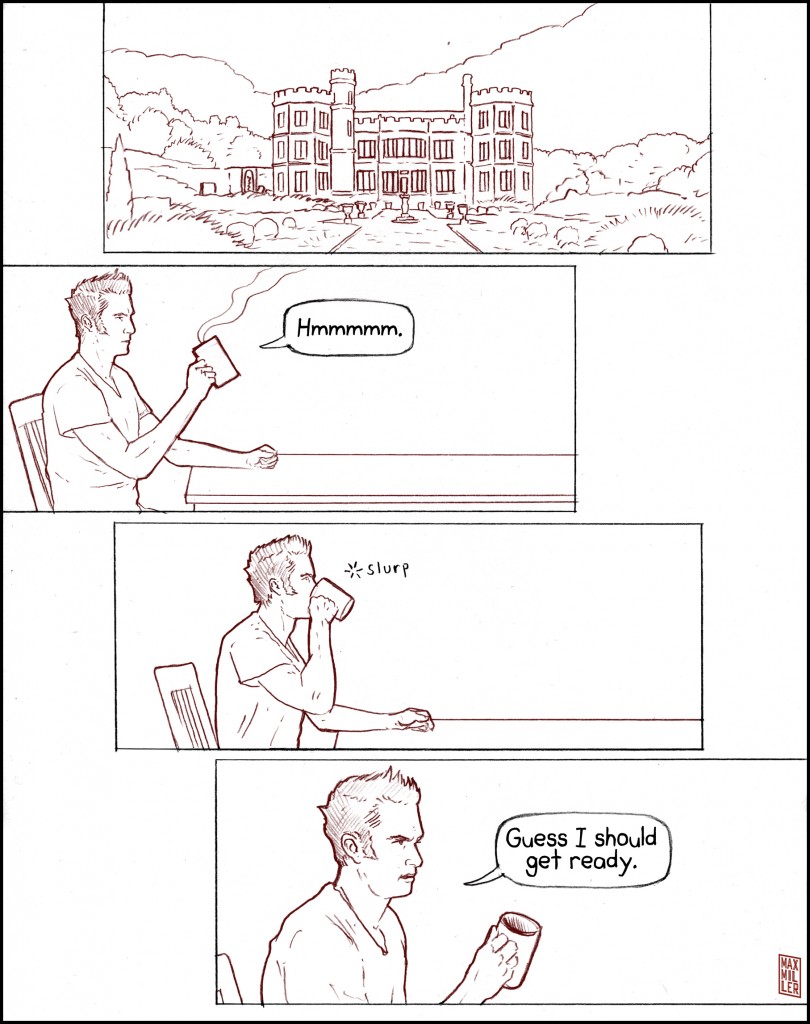
Let’s take as an example the reliable conceit of the establishing shot. Much like in the film medium, this is a shot right at the beginning of a new scene that places us in a new locale; think the exterior of a building, a forest glade, or a craggy mountain peak. One very effective trick is to bleed the establishing shot off the top of the page, opening up the scene and letting it breathe. Even if the reader doesn’t notice it, this can be a clever way to bring the reader right into the action.
With a bleed you are extending the border right of the page. In fact, you could do this with every panel, leaving no margin at the edge. It’s all about the feel you are trying to give the reader. These are techniques for influencing the atmosphere of your story, for every small decision you make, as the creator, has a great impact on the finished product.
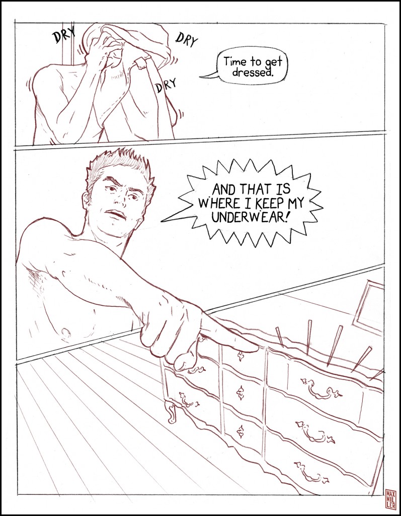
Small tweaks to the border itself can go a long way toward influencing how your work is read. Thickening, or coloring borders, especially in a page of simplified borders, can draw special attention to one particular area of the page. If you have a particular, key panel that you want to emphasize, setting the border shape at an angle, or giving it jagged edges will cause the reader’s eye to be compelled toward it. Though, watch out. If this is overused it loses its effectiveness, and cause a page to look overly busy or chaotic.
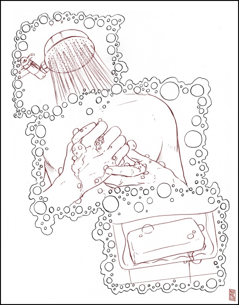
A note should be made about object borders as well. By ‘object borders’ I’m talking about actually creating a border out of some objects or motifs that reference the scene. For instance, you may have a scene set in a garden where the panels are framed by twists of ivy and roses. There are certain sequences in early the Alan Moore run of Swamp Thing where object borders are used to great effect to punctuate the atmosphere of a scene. The object border can be a crafty way to conduct the reader’s eye around the page.
Another, more blatant way to direct attention is with border breaks. Having an element break clear free from a panel, such as a character’s arm, or weapon, can be an extremely useful way to draw attention to a certain sequence. Think of all the times you’ve seen a superhero’s kick flying out the edge of a panel and you’ll have a good idea of what I’m talking about. By using the border break you, as a creator, are acknowledging the fundamental mechanics of the medium (flat, two-dimensionality), and going a step beyond that, breaking the borders to really punch up the action. But, like when using creative borders, you have to be careful not to let things get too busy with border breaks or they’ll lose their effectiveness.
Between all of these panels is a very important element called the ‘gutter.’ And it should never be overlooked, for this is where Scott McCloud says ‘the action takes place.’ If you show two panels, one depicting the beginning of an action, and the second showing the action completed, then the gutter was where that action happened. Your mind filled in the blank. That space between two panels, and how you treat it goes a long way toward influencing how your story is perceived. Do you use white gutters? Black gutters? Colored gutters? Wide? Skinny? Never be afraid to experiment and find what works best with your particular story.
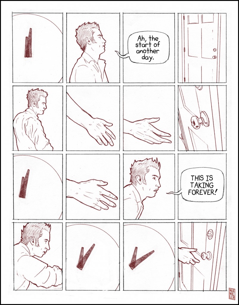
One final element to be considered in the construction of a page is the panel count. It’s generally accepted that five to seven panels per page is a good balance, but of course you can chop a page into a hundred panels if you can find a way to pull it off. There are no hard rules, because someone will always find a way to make nearly anything work. But, an interesting phenomenon that occurs when ratcheting up the panel count, is that it serves to slow time in the comic format. This is the opposite of what happens in film format. Think about a film sequence where you see a lot of fast scenes cut together in quick succession, like the shower scene in Psycho. That’s a very quick scene, but there are ninety shots from seventy different camera angles, all in forty-five seconds. Amazing right? Now think if those ninety shots were drawn out on comic pages. Whether you put ninety panels on one page, or spread them nine per page over ten pages, you’re looking at a lot of drawings. Time will slow down with more panels because the reader’s eye will typically linger over the panels at the same rate.
So, join me next time when I break down the deeper mechanics of page vocabulary, and until then, keep your pens to paper, whether you’re drawing or writing.
makingcomics.com


The last idea about the panel count is very interesting, and it will give a solid framework to any artist. But I think it can be different when you decide to make every pages more “independent” : The action stop at the end of the page.
You often see that in Bandes Dessinées (European comics), where a particular action doesn’t continue on many pages… As a result, a page with 8 or 9 panels isn’t necessary slow (maybe less dynamic, but not slow).
In any case, the artist must be sure of what he wants to show, should it be an action scene whit a lot of suspense or a long dialogue while the characters are going somewhere. At the end, it require a lot of “movie-making technique” like said in https://makingcomics.com/rd/2014/02/08/anatomy-storyboard-part-2-continuity
Thank you for this. It’s really helpful and I would so read that comic.
This is amazing. Thanks for sharing this.
Thanks for the generosity. I like the soap bubble panels. I haven’t thought of that before.