Continued from part 1, which covered resolution, color space, page size and position.
Number of pages:
While diversification of printing techniques means this is no longer always an issue, it remains an issue to be aware of when using offset printing. I am talking about the fact that the number of pages in a book needs to be a multiple of 16. This is due to the way offset printing, which makes use of large plates, works:
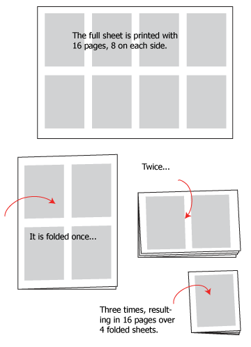

These signatures of 16 pages are bound together to form a book of 32, 48, 64 etc pages.
Based on the above, let’s clarify: to get your money’s worth, the number of pages needs to be a multiple of 16, because you’re paying for 16 pages at a time anyway. The plates represent the biggest part of the cost, and one 16-page signature in full color requires no less than 8 plates (1 for each of the 4 CMYK colors for each of the 2 sides of the sheet). No matter how much or how little contents there is, a 16-page signature must be produced using these 8 plates. There are ways to reduce this, for instance by having every other page blank or a single color, or using special plates, but this really requires working with the printer and I won’t attempt to suggest them here – if you’re interested, it’s as simple as asking your printer “What can I change to cut printing costs?” In any event, a 36-page book and a 48-page book cost the same, which is 3 signatures, but the 36-page one is wasting 12 whole pages. They won’t show up as blank pages because the printer will remove them, but if you’re printing 1000 copies, that’s 12,000 wasted pages you paid for! If the number of pages isn’t a multiple of 4, however, there will be blank pages by necessity.
This is why it’s important to have an inkling of how many pages your story will take up. If it runs just a little over a multiple of 16, it’s worth condensing it a little to save you a whole signature’s expense. If it falls a little short of one, plan for bonus contents to fill up those pages. Make sure to take metacontents into account, as well; these are the extra pages that contain items such as the title page, indicia, cataloging-in-print information, and so on (the title alone can eat up to 4 pages) and anything else that needs to be included like appendices and so forth (in my case, this included the language notes on the last page as well). Thus, comic pages plus metacontents should be equal to a multiple of 16.
If you’re publishing a series, planning is even more important as it’s a good idea to keep all volumes the same number of pages. If printing cost varies greatly from one to the other, they will have to be priced differently, and also, different page counts will cause weight to vary, and this means shipping cost will also vary. Believe me, you don’t want to have this kind of complication within the same series when you sell it on your website or send it to bookshops. This is assuming, of course, that you’re not an eccentric billionaire making comics in your spare time. When expenditure is not an issue, such rules can be ignored…
Margins and bleeds:
In a printed page, the inner edge gets eaten up by binding and the outer edge by cropping. Exactly how depends on binding type:
– Saddle stitch is when the book is folded down and stapled, as is the case with floppies. Note I don’t recommend this at all because it looks so cheap, but if your book is too thin for other types of binding, you may have no choice. In any case, this is what happens with this binding:
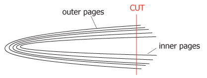 Notice how much more of the inner pages get cut than the outer pages. If your margins are just enough, they may look fine on the first pages, but near the middle of the book they’ll get very thin and some of the art may even be cut. On the other hand, the inner margins are fine throughout, as this binding allows the book to open almost flat at any page.
– Perfect binding is when pages are glued together to the spine and the cover wraps around that, allowing for a title to be printed on the spine if thick enough. The glue can be reinforced by sideways stapling, but that is quite hidden. It looks cleaner, more professional and makes a much better impression, but can only be used starting from a certain thickness (more on that under Choice of Paper). With this binding:
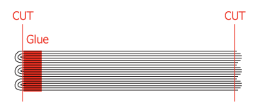 The damage to the outer margins is much less, because pages are put together in smaller signatures (fewer are folded together). On the inside, however, there’s a slight cut just to remove the thickness of the fold, and a full 0.5 cm eaten up by glue and by the fact you can’t open the pages fully without breaking the spine. This is where the inner margins need to be given ample space. My advice would be to always aim and work for this type of binding: a graphic novel has nothing to gain from saddle stitch, and if it’s too short or flimsy for perfect binding it may not be worth the expense of offset printing – best wait to have several chapters and print something more substantial.
– Let me also mention hardcover binding, though this is not usually affordable without a successful Kickstarter campaign or some other funding. This is the king of commercial bindings, with signatures stitched together so the book is flat and even when closed, and opens neatly anywhere.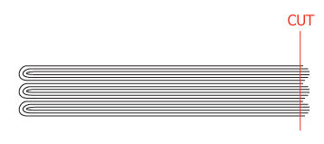 The outer edge of the pages is cut but as signatures are 16 pages, there isn’t a dramatic effect as with saddle stitch.
This was so you can visualize how to plan margins depending on future binding. Before getting down to preparing them, we need to discuss bleeds. A bleed is when the artwork extends to the very edge of the printed page. This is not a necessity, plenty of comics and graphic novels keep away from it, and they can ignore this bit. However, if your artwork contains bleeds, then it needs to extend beyond the edge of the page. Cutting is never completely accurate (we’ve seen how binding influences where it falls), and if the art doesn’t extend enough, you can end up with a very unsightly white line on the edge of the page. The industry standard for bleeds is 3 mm (at least on my side of the ocean; that’s about 1/8 of an inch in the U.S./Imperial System countries): that’s 3 mm added to the size of your printed page, on each side that will be cut. To clarify this, let’s create a page template that you can then use for all the pages in your comic. If you work on paper, this is still useful for calculating measurements.
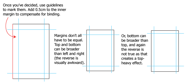
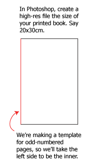 Next, decide on your margins. There’s no set rule for their size, but they should not be thinner than 1.5 cm. 2 is better, and they can be much broader to create a certain effect. If at a loss, examine comics of the same size as yours. How wide are the margins, and do they seem right, or too thin, or too much?
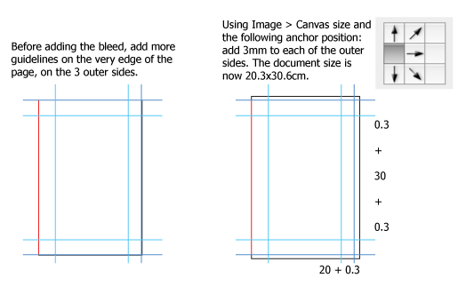 There’s one more step to complete! This is the page at printing size, but we want our template to be at working size. This is where you increase the size of your template by going to Image > Image size and entering the value that works for you, for instance 150% or A3. The reason we started with final size and worked backward is that it’s a headache to calculate what a margin should be on the larger size so that it becomes 2 cm when reduced. I made the huge oversight, when I first started, of adding my bleeds to an A3 page, so that they were much too thin once scaled down – but I never realized until the book was completed, and I had to go and rework them all!
Once you have this template done, you can create all your pages from it and know they will be correct when rescaled. Don’t forget to create a template for even-numbered pages, by flipping the canvas horizontally (this will reverse the guidelines as well.)
Choice of paper:
One of the prime advantages to offset printing is that you have the full range of paper at your disposal, including special metallic paper if you so desire! Visit the printer or at least ask for samples, because even supposedly “plain white” paper comes in a variety of textures and coating. There’s no right or wrong here, you need to choose based on your own vision of the look and feel of your book. I imagine many people won’t want to go so far and just want simple white paper, but be at least aware of this: the standard paper types of the book industry will come at least as uncoated, coated, semi-gloss or glossy. Uncoated is like your average printer paper, fine for novels but not recommended for color work as the surface is rough and the ink will spread a little. Coated is better for fine printing, but dulls colors. Glossy is the finest but the shiny pages are distracting and they take fingerprints like nobody’s business. Semi-gloss is the best compromise and will keep your colors vibrant without attracting attention to itself.
Another important consideration is the paper weight, and this is where sitting with the printer can really pay off. What is too thin, and what is too heavy? It would not be useful for me to give too many numbers, because that varies subtly with the nature of the paper, but as an example, I use 135gsm paper for my comic’s contents, and 250gsm for the cover. At first I used heavier paper for both, but with the second volume my page count rose and what was a beautiful balance became very heavy and problematic. Here are things to think about:
– Heavier paper: it looks better, makes the book feel more valuable. It also makes it heavier, hence higher shipping costs. It also makes it thicker, so it quickly becomes too thick for stapling; by the same token it allows you to use perfect binding with fewer pages. Finally, thicker books mean they take up more space wherever you’re stocking them.
– Lighter paper: if it’s too light it feels flimsy and cheap. But if you have a lot of pages, it can make the book lighter and less onerous to ship and to stock. It can force you to use saddle stitch if your page count is low.
A printer can, upon request (if they’re good with clients), make a mock-up of your book using blank paper of the weight requested, so that you can see exactly what it feels like, how thick it is, and how much it weighs. This way you can conceivably tailor a book to look as good as possible while remaining within a certain weight category, if most of your sales will be by mailing the book yourself. For the cover at least I can say that 250gsm is almost ideal for a softcover: lighter than that and it doesn’t feel like a cover, heavier and it can create problems during binding. Always have your cover laminated to give it that quality finish that will also protect it.
Finally, think of the planet.
Some printers have converted to eco-friendly printing processes. They use water-based inks and plates that degrade without poisoning the environment. These printers may be a little more expensive, but that is something we owe. In the end, our work is not a necessity, and no matter how many people derive pleasure from it, printing it remains a little act of vanity that consumes paper and energy. The least we can do is give a little extra to limit the harm we do in the process.
Click here to check out Part 1 of the Offset Printing Tutorial!
__________________________
You can see more of Joumana Medlej’s work at http://www.malaakonline.com/
OH THANK GOD! Somebody actually covered this! ALL HAIL JOUMANA!!!!
Knowing this can save you “LOTS” of money when it comes time to print.