With all your settings together, the process of lettering mainly becomes a matter of good form. This applies as much to lettering with pen and paper as it does to the digital medium, but digital formatting amplifies the issues of good form because the feedback from a tablet and stylus is much different from what you get from pen and paper. In short, the tablet produces the tendency for lines to wobble, because the pen can tend to slip. This is particularly likely to happen if you aren’t using a properly controlled hand posture while you letter. (See why I was so specific in the first part?)
When sitting down to letter a page, don’t try to letter everything at once. Instead, do a sentence at a time, as a long, single line of text. Once it’s done, select it with the marquee tool and move it out of the way (so that you can reuse your guidelines) and start the next sentence. This first draft of the letters should be done with the same pen, so that all the text has the same line weight – you’ll add all the emphasis, like boldface and italics, later on. The key at this stage is to make your lettering as clean, straight, and consistent as you can, so that it’s all uniform in size and proportion.
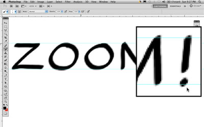
 Lines on a page, oddly enough, tend to be straighter and smoother when they are longer, because of a person’s natural tendency to use the whole arm to make long lines. This is where a digital format for lettering comes in handy – because a page in Photoshop is essentially scaleless (by which I mean that you can zoom in very far) you can letter at a very large scale, and this will help you to produce straight, smooth letters, making the lines with broad gestures rather than tiny hand movements. I normally zoom in to make my letters about two to three inches high on the monitor when I draw them, and this helps keep them crisp and easy to read. Don’t letter the way you write – aim for straightness in the verticals, horizontals and diagonals, and smoothness in the curves.
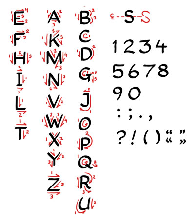
  Don’t try to make your letters in a single motion, but break them up into distinct gestures. A “D,” for example, should be lettered in two parts: the straight vertical stroke and the curved back. An “H” would be three strokes, a “W” four, and so on. This is all based mainly on common sense and personal preference, and I’ll come back to construction in a moment.
 First, however, a few lettering conventions are worth discussing. The matter of serifs is an important one. Serifs, if you don’t know, are the little chiseled marks at the end of block type, and are typically found in formal book print and on typewriter text. They make text look very hard and machined, and in general are not appropriate for comic book lettering.
  This is not a hard and fast rule, of course, but in general, you will probably want to design your letters without serifs – this is called a “sans” or “sans-serif” lettering face. The single exception I use is the personal pronoun “I” as in “I lettered the page,” in order to ensure it is not confused for the number “1.”
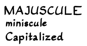
Next is the matter of using uppercase versus lowercase letters, or more formally, majuscule versus miniscule letters. By convention, comics are normally lettered in all-majuscule letters in the United States. In Europe, the convention is much less strictly followed, and of course, in non-European languages (namely, the languages derived from Latin and Greek), there is often no clear counterpart, and so the point is often moot.  I have designed lettering for both conventions, and I much prefer all-majuscule lettering because it makes the lettering clean, clear, and readable, and avoids a lot of compound letter shapes (like a and e) and subducted letters (like q, p, y, j, g) that can make line spacing difficult. But here, again, it’s mainly a matter of preference, and determining what stye suits your composition. My current comic, for example, is a military drama, so miniscule letters don’t really convey the right tone; but the comic masterpieces of Hergé are all lettered in capitalized miniscules, and set the mood perfectly. You should do plenty of tests to set your lettering conventions before you start, and try to maintain consistency throughout.
![]() Inflected languages like French, Spanish, Portuguese, Italian, and others have a special case that’s worth mentioning that may escape English-speakers: accents. Although capital letters are frequently left without accents, all-majuscule lettering should, I think, always carry the appropriate accents when lettered for comics. This ensures proper pronunciation and context, especially since there can be conflicting word forms without proper accenting. Also, you should write out all numbers whenever possible, with the exception of dates and years. That is, you should generally write out “one, two, three” instead of “1, 2, 3;” but write “December 7, 1941” instead of “December Seventh, Nineteen Forty-One.”
Inflected languages like French, Spanish, Portuguese, Italian, and others have a special case that’s worth mentioning that may escape English-speakers: accents. Although capital letters are frequently left without accents, all-majuscule lettering should, I think, always carry the appropriate accents when lettered for comics. This ensures proper pronunciation and context, especially since there can be conflicting word forms without proper accenting. Also, you should write out all numbers whenever possible, with the exception of dates and years. That is, you should generally write out “one, two, three” instead of “1, 2, 3;” but write “December 7, 1941” instead of “December Seventh, Nineteen Forty-One.”
 Okay, now that all that’s out of the way (important though it may be) let’s talk technique. To do this, I like to break the Latin alphabet up into what I consider the “Simple,” “Moderate” and “Difficult” letters. The simple letters are all straight lines, and generally have a square or long rectangular shape. In majuscules, these letters are E, F, H, I, L, and T. The moderate letters require centering and symmetry and take a little more planning and practice, but have similar proportions and mostly straight lines: A, K, M, N, V, W, X, Y, and Z. The difficult letters are the ones with curves: B, C, D, G, J, O, P, Q, R, and U. There’s also one special case, S, which is, I’ve found, the hardest letter to form. In general, when building a lettering alphabet for myself, I find it easiest to work through the letters in those three groupings rather than from A to Z, because it will give you a more progressive feeling to the pen strokes you’re making as you build up your set of letters. The specific letters can be constructed in any way that suits you and your comic, but it’s worth drawing attention to a few common pitfalls.
First is the letter M. The tendency for beginners is to stop the diagonals of the M midway down the letter’s height, but this makes for a weak-looking letter and tends to make the M narrower than it ought to be. Try to practice making the diagonals go all the way to the base of the letter, and set the angle of the stroke to make a nice symmetrical or nearly-symmetrical letter. The letter W can also be constructed this way (only in reverse) but I personally prefer to do the opposite, in order to keep it from looking like an upside-down M.
A similar tendency makes many people construct D, P and R with the curve too close to the top of the letter, again making it look scrunched and hard to read. Try to keep the curve smooth and open. It may help to make the straight vertical stroke as a separate line, and then add the curve as a second stroke, instead of trying to make the letter in a single motion. Likewise, with Q, O, and especially S, make the curve with a single, smooth stroke – I like to add a slight slant to it, as well.
When you have your lines of dialogue lettered out, you can begin the final process: composing them on the page.
_____________
HAND LETTERING A DIGITAL COMIC PART 1
HAND LETTERING A DIGITAL COMIC PART 2
HAND LETTERING A DIGITAL COMIC PART 3
See Mathieu’s webcomic and blog here: www.viciousprint.com/6commando
makingcomics.com
Great tutorial. I’m using Manga Studio to letter a comic project of mine (slowly but surely) but the overall idea is the same as what you’ve outlined here. Something that really helps me is using a template layer for my guidelines. Here’s an example of the first page I really felt was a success with my digital hand lettering:
http://instagram.com/p/i6S3VTNe-J/#
Thank you so much for this article and this series..I never really gave lettering much thought.I showed my penciled pages to a friend of mine just a week before I saw this series and she said that she loves the hand lettering on my pages as opposed to the digital letters I use in the final work.
I then wondered if I should letter my final pages as well. little did I know that there’s this much to consider. thank so much yet again…this will go along way in helping me get a proffessional looking final product
I prefer the pre made, I don’t have time for this.