Announcing our FREE Golden Ratio Workshop designed to expand on the concepts introduced in the article below!
Excitement would understate how I felt when I read Frank Santoro’s articles on the first appearance of the Golden Ratio in Hergé’s TIntin comic pages. Santoro used grid overlays to explain comic composition with geometric shapes in a way that could be easily understood by a graphic designer, like myself.
Golden Ratio: A numeral value studied by ancient Greek mathematicians that reappears in geometry and the natural world. It has since been used by artists and architects as a basis for the compositions and structures that are naturally pleasing to people. Many scientists have studied the reasons for the appeal of the Golden Ratio, but have yet to find a logical explanation.

As I have a background in graphic design, I was immediately drawn to the grid system because we use a similar system called the Typographic Grid. I saw an opportunity to combine my interest in design and illustration. One could say “well, that already happens in comics through the use of text and image,” but this was on another level.
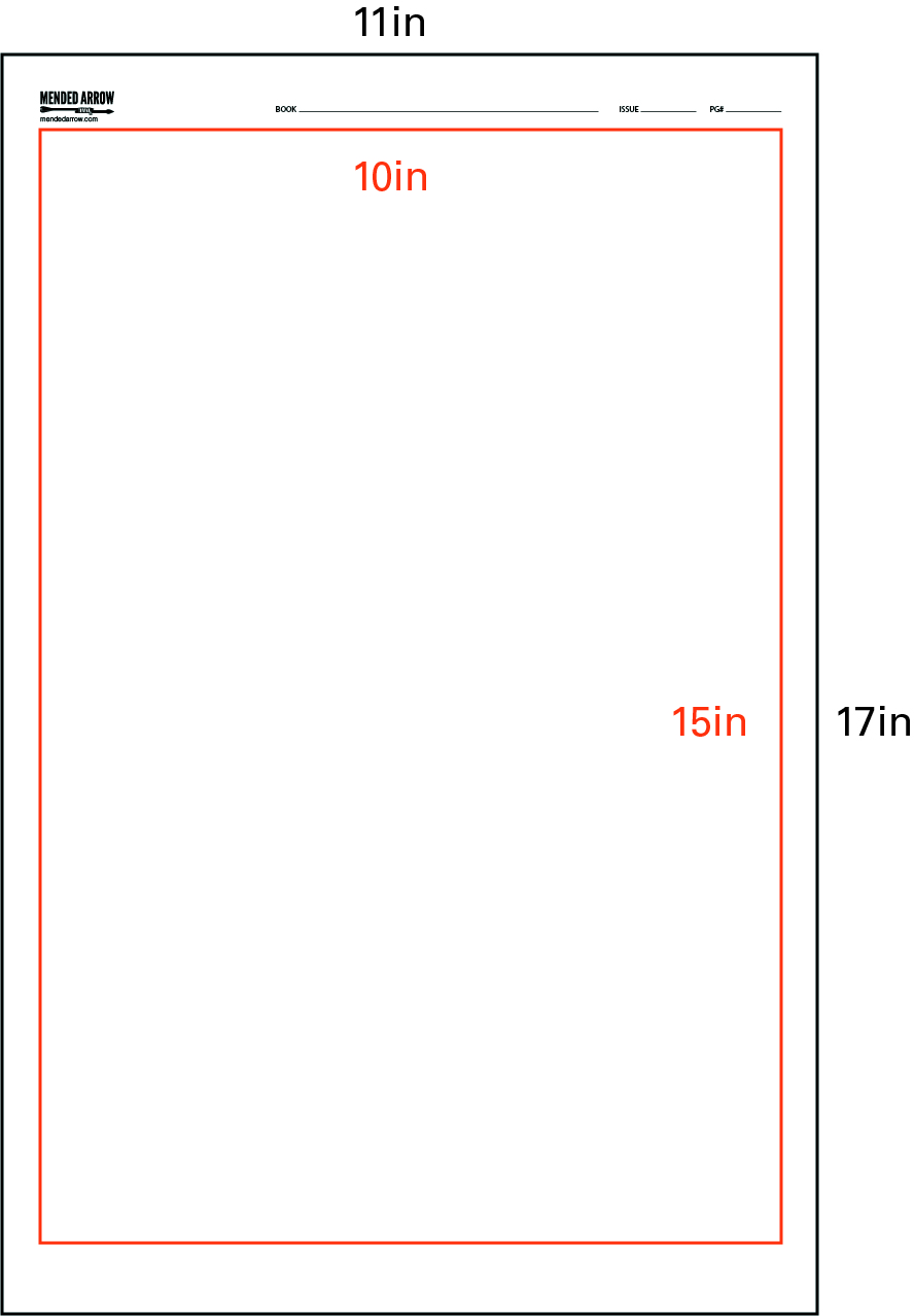
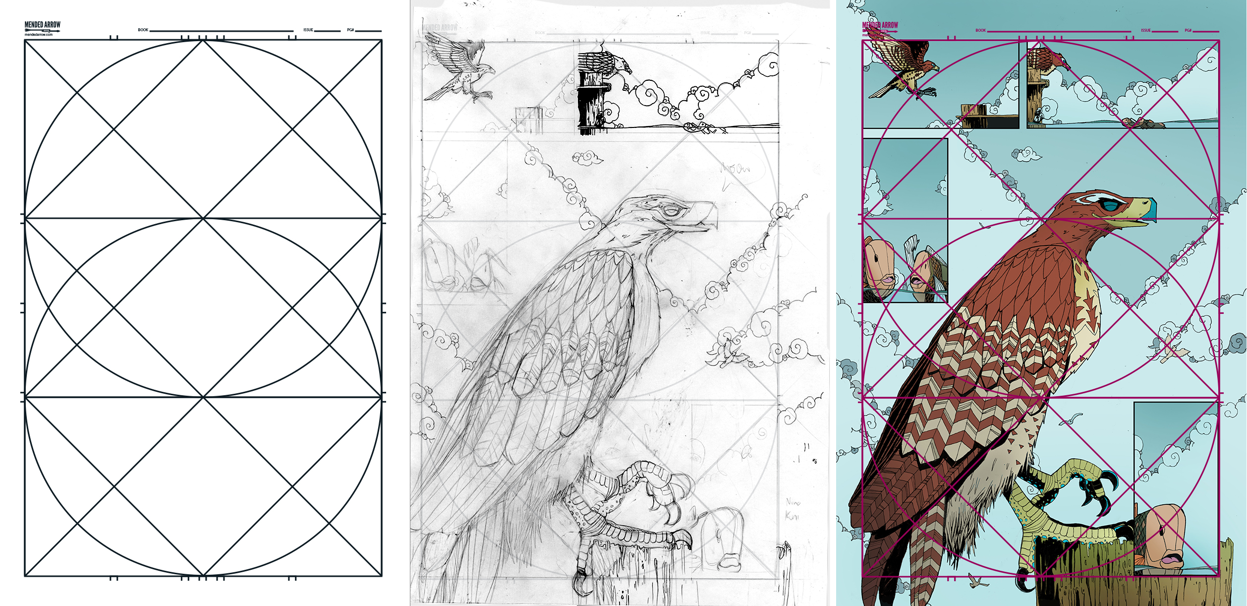
Santoro’s articles encouraged me to develop my own blue-line grid using similar notations, but not by utilizing the Golden Ratio of 1.61803398875. This system uses a 1.5 ratio which is quite common in the comic world. The page dimensions are 11” x 17”. My inside content area is 10” X 15”.
This grid differs from most blue-line pages you might buy from the local comic shop because:
1) it utilizes a consistent system of 3rds
2) differentiated gutter sizes
3) allows for staggered panels
4) uses circular/linear systems for composition
In this article I will take you through how I built the grid, and how I use these visual systems to create harmonious compositions across multiple pages of a comic.
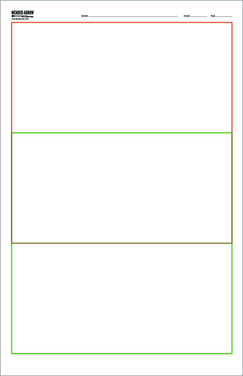
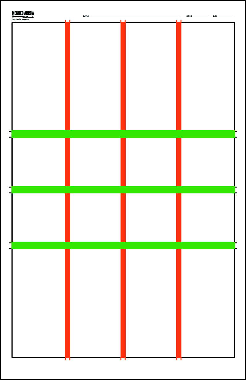
System of 3rds
Some blue-line comic pages that I’ve looked at aren’t spaced-out quite evenly. This grid is equally divided into 3rds across the vertical axis. I did this by overlapping two squares so that the top square terminates at the middle of the bottom square — making the inverse true of the bottom square.
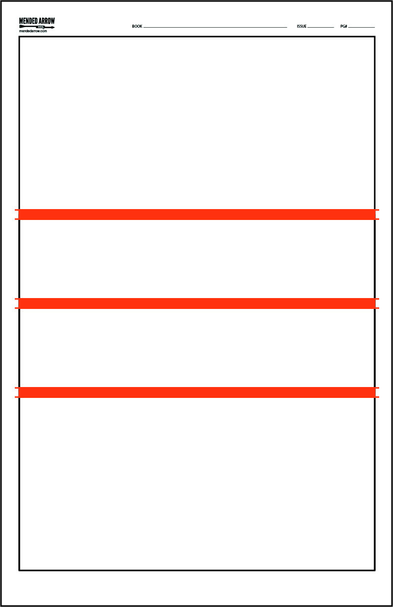
Panel Gutters
After I draw the squares, I align my horizontal gutters on the axis where the squares overlap. I also add an extra gutter notation in the middle in case I ever want to do a half-page panel.
Gutter: The space that separates panels in a comic.
Differentiated Gutter Sizes
Next, I divide the horizontal area in half two times — creating four potential panels across. I keep the vertical gutters thinner than the horizontal gutters. Greater horizontal proximity encourages the reader to group each row of panels for easier reading.
Panel: One isolated image in a comic.
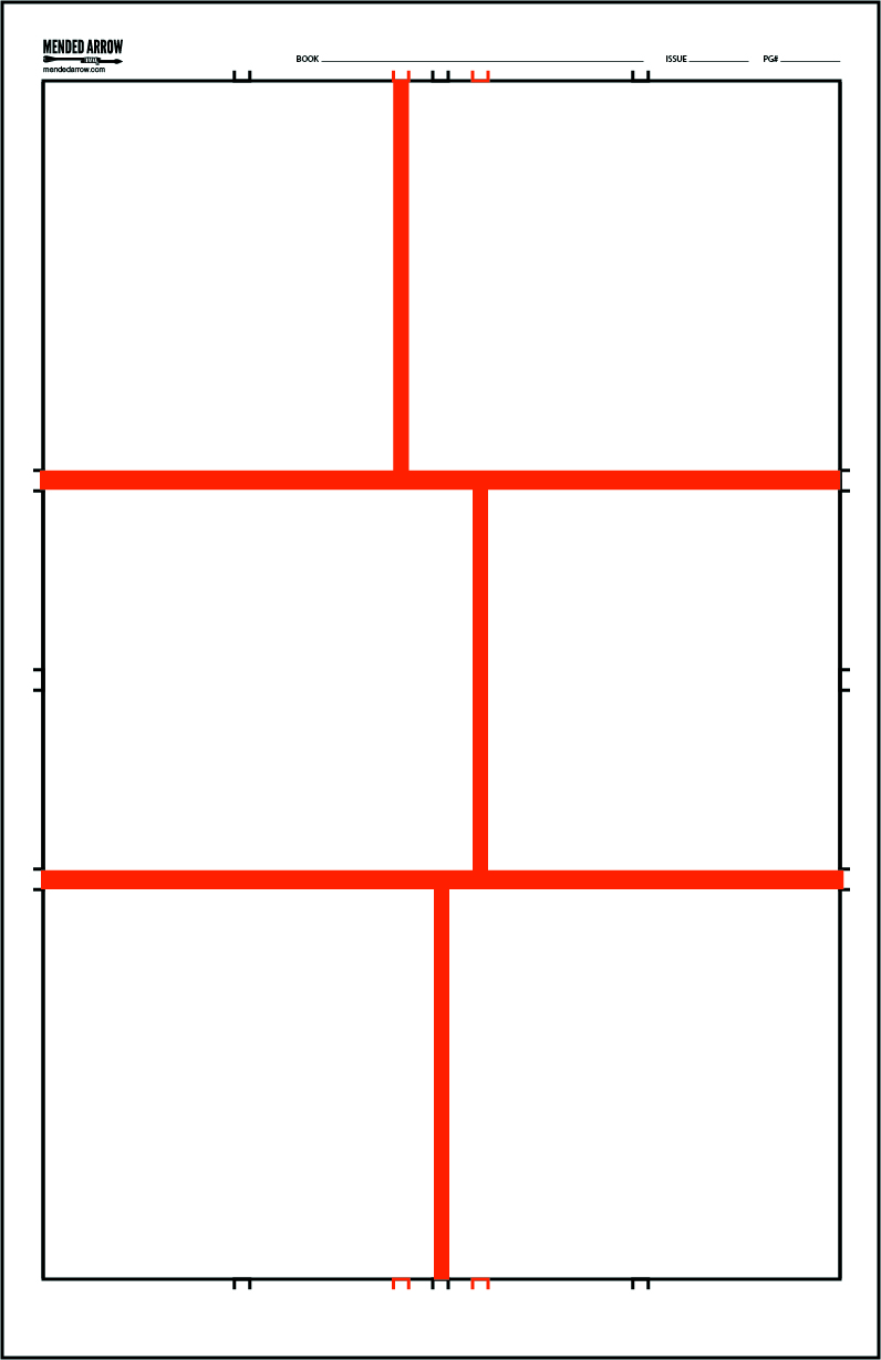
Panel Staggering
I rarely use four panels horizontally across a page because they are so thin, but I will often use two panels per row. I started studying Hergé’s work and noticed that he staggered the gutters of his comics. I came to the realization that this was to prevent what designers called “rivers.” A river occurs when there is a gap in information that coincides with a gap below. The danger is that a reader might drop down to the next line of info before completing the first one. So I placed gutters to the left and right of my middle gutter guide which will allow me to easily stagger panels throughout the page.

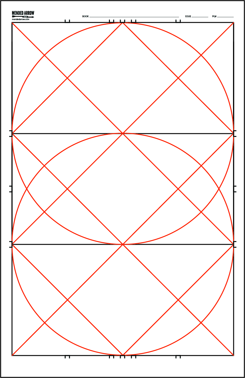
Circular and Linear Composition Guides
After creating three horizontal guides, I place circles in the squares that result. Additionally, I include guides at 45 degrees that connect with the corners of each square and the center of the gutters. These guides will aid me in creating harmony and/or dissonance by helping me to arrange panel layout in parallel and perpendicular axes.
Using the grid
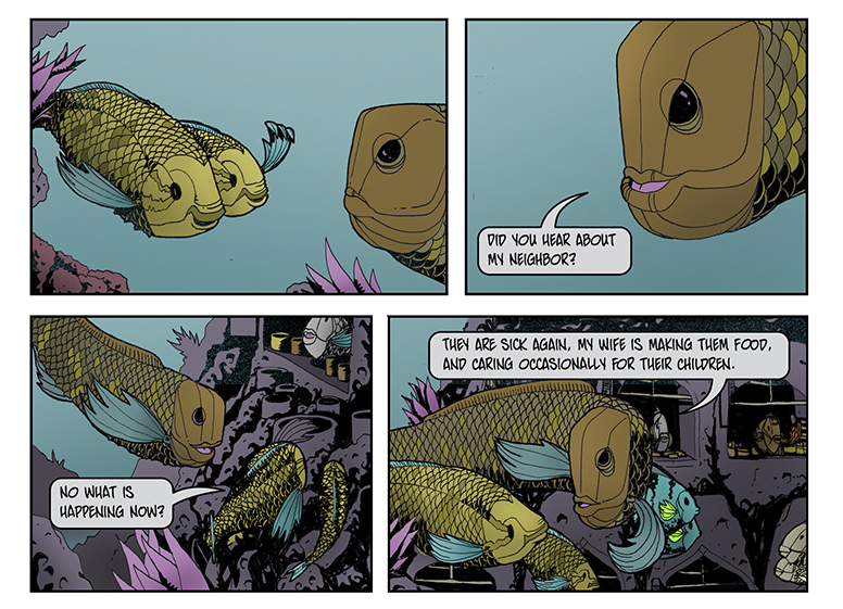
To illustrate this circular grid in action, here are examples from my current project (with James Moffitt) The LIttle Red Fish — not just to hype myself but because, as far as I know, I am the only one using this specific system.
My personal preference is to use a light box to physically draw the grid in pencil on a piece of bristol paper. I then draw my panels and images (also using pencil) based on completed thumbnail sketches. I then ink them directly on the paper and color it digitally on a computer.
Light box: A flat box containing one side of translucent glass or plastic and an electric light, so as to provide an evenly-lit flat surface that makes tracing an image between two or more paper surfaces possible by hand.
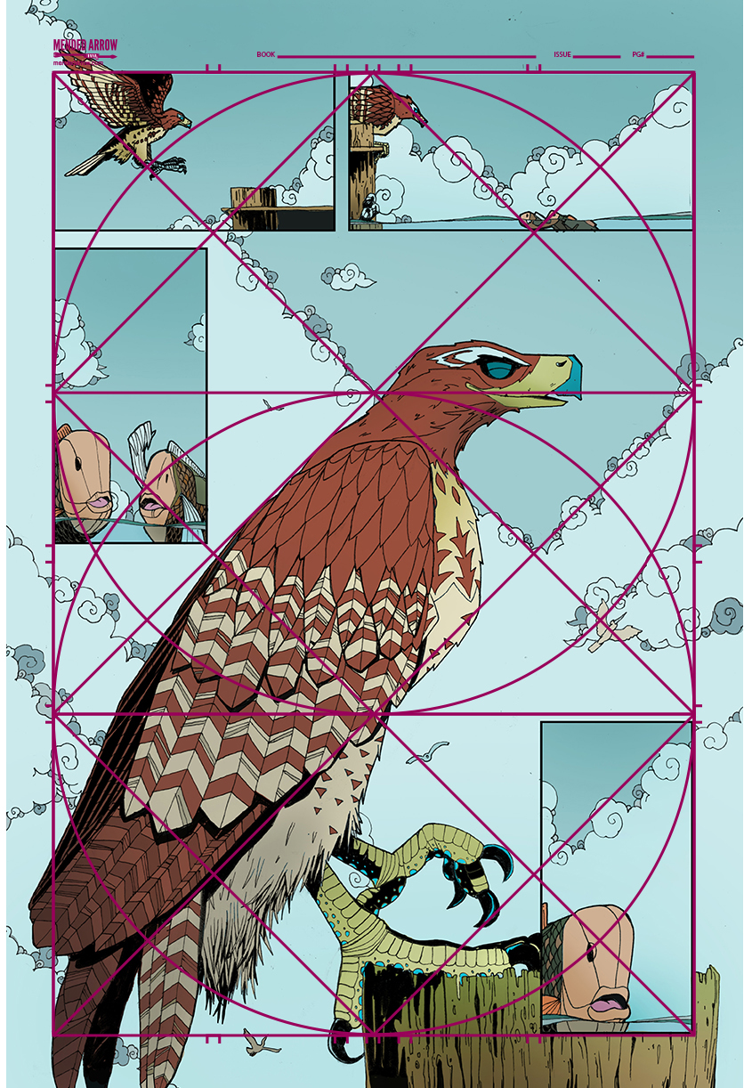
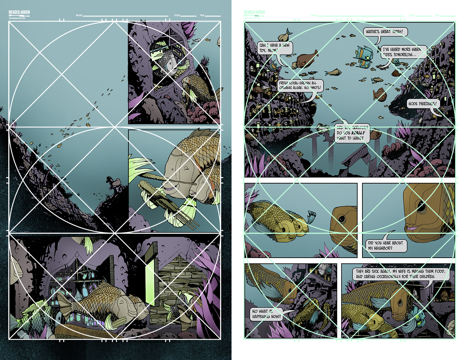
When using the grid, I try to make sure that at the end of each row, there is a visual element that directs the reader to the bottom left of the page. This might be the direction that a character is facing, or an object that a character is using to point with such as: an algae kabob, dagger, beak, fin, etc. The theory is that it will aid the reader to jump to the next row of panels.
You can also use this tool to create visual dissonance. Having characters consistently face in opposite directions in the comic can be used to exaggerate the tension between them.
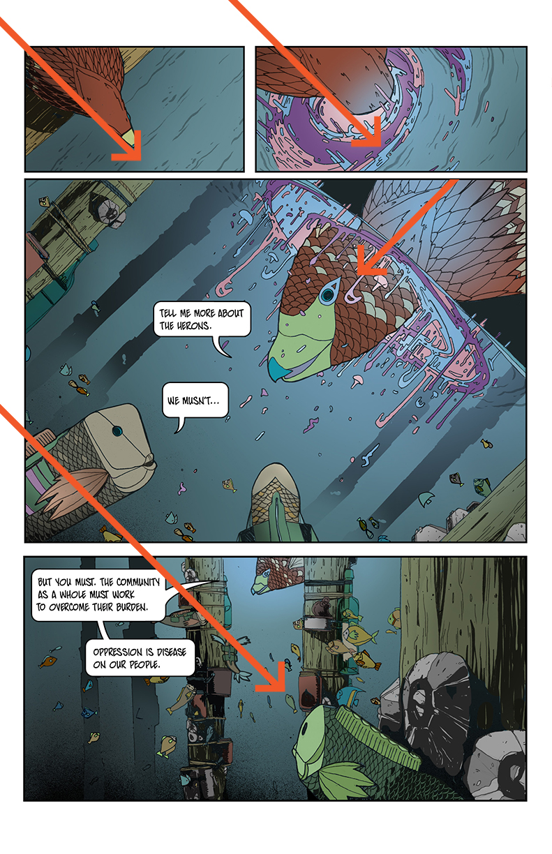 It is important to recognize that composition within panels helps the reading flow just as much as the gutters and layout of the overall page. I also focus especially on the use of diagonals. They are an easy way to make the comic dynamic during points in the story that can come across as bland without them.
These layouts are available FREE for download here: http://www.mendedarrow.com/bluelinegrids.zip
More of Bizhan Khodabandeh’s work can be found here: http://www.mendedarrow.com/
You can follow some of the behind-the-scenes work on The Little Red Fish here: http://instagram.com/littleredfishcomic
Also, be sure to check out Bizhan Khodabandeh’s Kickstarter – The Infinite Canvas!
makingcomics.com
Fantastic article! It’s incredible what a solid grid can do for composition.
Oh, and these pages look sick, Bizhan!
I second this. Fantastic layouts, all available for FREE! My panel layouts have never been happier.
Thanks Kevin. Happy to provide resources for folks!
Thanks Mark!
Thanks Mark! 🙂
Whoa, this is pretty awesome! I’ve been occasionally using the Fibonacci Spiral to aid page composition, but that stuff only really works for splash pages (at least for me). I’ll definitely use the grid you provided the next time I’m drawing a layout for a page!!
Er, guys… The link for the layout download is not working! Hope you fix it soon so I can grab some =)
We will work on it ASAP
Fixed! Sorry bout that. Had an extra space in the address for some reason…
The link still doesn’t work
It didn’t work for me either but I found a solution, don’t click on the link, copy it and search it in the url Google bar, it started the download for me
That is outstanding. going to try this on my next pages.
Totally going to print this out and tape it to my desk as reference. Thank you so much!
This article was awesome! Great use of examples to explain and demonstrate the value of the golden ratio.
I felt like an idiot because I tried making one of these in Manga Studio 5, and for some reason I could not divide the page into thirds. Then I remembered: Oh. Right 15/3=5
*smacks head with hands*
Very useful, thank you for sharing!
these are so helpful, thank u so much for sharing these
I would have said earlier that there is no catch-all template for page design, but DAMN! That is pretty comprehensive and easy to lay out, with stunning results.
Kelly Sue is a fan!
This is very interesting. I’ve made my own panel template for 3, 4, and 5 panel rows and columns, and I may try incorporating the circle and diagonal grid to see how it works for me.
One thing I thought you might like to know is, if you’re looking to make a comic at 6.625″ x 10.25″ (a standard modern comic print size), the trim area before reduction is typically 9.9375″ x 15.375″, and 10″x15″ is closer to the bleed line (which is anything past trim, but I use 10.5″ x 15.75″). So that means your safe area has to be within the trim area. Of course, your book can be any size you want, but if you’re using 11″x17″ board, you’re going to run into the problem of either not having enough art for bleeds, or stretching your 10″x15″ safe area close to the trim and gutter.
9″x13.5″ is a direct 2×3 ratio that you can put into the trim area. Mainstream comics (DC and Marvel) use a longer area (supposedly 14.0625″ L, which is a weird number), but 14.25″ L is a good number to divide evenly into 3 and 4.
Wow this is very informative and helpful, not to mention beautifully done. Thank you so much!
I like it… I did’nt know that, i don’t remember thta comics panel layout.
Dear,
My hobby is drawing and then I like anime in comics. I think of you, But I’m so sorry boss, I’m not good in spelling and then I failed it, beacuse It’s my fault. I always drawing in anime of new comics.
dear sir and ma’am ,
I’m so sorry sir and ma’am. My hobby is drawing, because I like it drawing. I think of you my boss in comics panel layout that so new my comics of title. But I’m not good in spelling, bec. my fault and then I failed it, I feeling nervous and afraid. I always my drawing in comics.
please you tech me!!! bec. I think of you….
welcome,
Bea Colleen Disu
dear sir and ma’am ,
I’m so sorry sir and ma’am. My hobby is drawing, because I like it drawing. I think of you my boss in comics panel layout that so new my comics of title. But I’m not good in spelling, bec. my fault and then I failed it, I feeling nervous and afraid. I always my drawing in comics.
please you tech me!!! bec. I think of you….
See, your immediate problem is that you approach comics with a design-first mindset, not comics-first with an integration of design. It’s a rookie mistake.
Rivers don’t EXIST in comics. He staggered panels as a stylistic choice, not to evade a design body copy principle which doesn’t apply to comics. My reply is two years too late, but maybe you’ll read this and regain your common sense.
I should’ve trusted my browser that said your website was malware, because your opinions are just as cancerous.
This seems unnecessarily trollish. Can you give me a kind, specific, and helpful response so I know you aren’t just trying to take a hurtful swing at someone’s work on our site? How would you have written the article differently? Just know that we are trying to encourage a community of learning. There isn’t anything wrong with disagreeing with something said – there is something wrong when you are using words that are purposefully hurtful when doing it.
Also, apologies about the malware warning – our site was hacked. Safe and sound now though!
I wanted to start making a comic but wanted to cut down on time, is there any application or anything just to make boxes for the layouts of each page? Anything helps. 🙂 Thanks!
I’d check out Manga Studio, Gimp, or Photoshop. Each has a bit of a learning curve.
If you are a aspiring comic illustrator college kid like me, these helpful techniques are lifesaving and they makes me sound real smart in class too. Thanks for taking the time to help people along with their artistic careers.
Your very welcome! We love to help people sound smart. 🙂 -P
Great article, thank you so much for sharing!
Great article. Thoughtful approach to bridging design and comic illustration. The examples really pop within this framework. Thank you
Bizhan Khodabandeh,
Hello, my name is C. Edward Sellner and I do a weekly ‘how to’ column on creating comics at my studio’s main site (linked above). I’d like permission to refer to your article, include some of the graphics and then in the resources section of the article a link to this for those who want to check it out directly. I just discovered this site a while back and have already included a Making Comics link on my archive page for general interest, plan to pull some other specifics from it and others like it, but then also add my own insights and experience. Let me know, thanks!
Please feel free to link to us all you want! Share graphics (just make sure you credit the author.) -Patrick
Absolutely. I’ve included the link to the archive of my weekly column as well, if you guys find it helpful, I’d be happy to have it added as a resource on your site. Let me know.
great article – a friend just shared this with me.
to make panels even i also follow (width-(columns-1)*gutter)/columns rule.
… and your artwork is awesome!
Thanks!
Any suggestions on how to make this proportionate for twice up pages?
showing me your free form circle layout I have been drawing T Shirts for 50 years .I use heavy gage vellum onion skin I just went back to Old school ways after 4year before computers. I just found a Lucy graphic what a joy for layouts then scan 20% blue cyan on to my inking pages. and print my board. text layout ect gutters and gallies. still use a meso goat,
and horses hair brush some Copex and Iam at @TerryFadden intagram hand painted freehand hats use only F&W And Bombay paints.or get pins from nova paints pins from Primo art supplies.refillable. and paint pins
or wicked black and whites
here my fav.uniball white gel pin the best white over any color fine line. washablegreat for foam on waves. and surf edge or lettering highlight and who the outlines.a art store person ture me on to it and I can reverse dagger shade great .sure crisp. regards Terry also at of hardest surface to ever paint. mine last 5years Rick Griffin taught me on my best friends. and R Crum from the fillmore West poster days
Regards
Hi! Loved the article! Do you know where can I read Frank Santoro’s articles on the first appearance of the Golden Ratio in Hergé’s Tintin comic pages? Could you provide me with the link to the article? I’ve been looking around and I can’t seem to find it!
Awesome! I’m a prospective comic book writer and artist starting my first ever project. I’ve still got to finish wrapping up the story and starting the script, but I decided to take a peek at panel layouts. Thank you for the awesome article!
“Many scientists have studied the reasons for the appeal of the Golden Ratio, but have yet to find a logical explanation.”
The answer is a bit less mystical. Here’s a good explanation: https://www.google.co.za/amp/s/amp.iflscience.com/plants-and-animals/why-is-the-golden-ratio-seem-to-be-everywhere-in-nature/
“Many scientists have studied the reasons for the appeal of the Golden Ratio, but have yet to find a logical explanation.”
Here’s a good explanation: https://www.google.co.za/amp/s/amp.iflscience.com/plants-and-animals/why-is-the-golden-ratio-seem-to-be-everywhere-in-nature/
Thanks for the excellent piece on page and panel lay-out.
So this is a full bleed composition.
Do you ever use a graph for safe areas or trim line?
Thanks