Hello once again, everyone! This is the third and final installment of my blog post series about my comic review checklist that I use when editing comics for CarpeChaos.com. To read part one, click here. To read part two, click here.

I won’t spend too much space explaining why checklists are important. It doesn’t matter how complicated the task—checklists are great, and they are a great help for editing comics too! Previously I explained what I look for when going over page layouts and how I review the words when they make it into word balloons, and this is the final piece: checking for all of those little mistakes that can distract the reader or induce that vague sense of “something’s not right here.” If you don’t have an editor, it would definitely be a good idea to give your pages a final looking-over with this stuff in mind. I now present to you the nit-pickiest of my checklists!
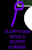
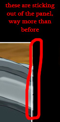
When I check for this I like to say I am conducting a “border patrol.” Basically it’s a reminder to spend time making sure that there are no digital layer mistakes and no stray marks on the pages, because accidental stray marks or special effects that bleed into a gutter are ugly and unprofessional (unless they are intended). The examples to the left and right show just two “bleeding panels” I found when developing Moments of Elation. We learned a valuable lesson from that comic: make the gutters their own layer and put that layer above every other layer so stray marks are hidden underneath! Then you won’t ever have to worry about dirty gutters! If only there were an easy way to keep real-life gutters that clean…
- Does the art look correct? Are there small mistakes?
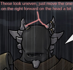 Odd-looking artwork can distract a reader, especially when the art is at a higher level of quality EXCEPT for the one or three things that look off. This is something that you might want to have a friend help you with, because it can be hard to spot your own small mistakes. Not all of us have the requisite OCD to do this well. If you don’t have a friend available, a nice trick is to mirror your artwork and then look it over as if it were something new. I don’t know why it makes such a difference, but reading your comics flipped can really help you see artwork problems you couldn’t notice otherwise.
- Are all of the characters consistent and anatomically correct?
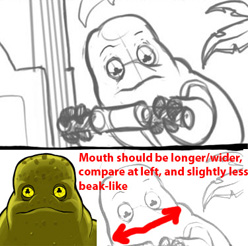 Generally most graphic novel projects first go through a planning phase where the major characters and environments are detailed, to be referenced later. Speaking for myself, since all of our characters are non-human, we had to design each alien species in detail to make sure we didn’t change their anatomy as we went along. But even if your characters are human, you want to make sure their costumes and attributes like height and hairstyle don’t change over time (unless it’s intentional). That means checking over each drawing to make sure they don’t deviate too much from the original designs. Taking the time to make corrections for the sake of consistency has the added benefit of making the characters more easily recognizable, and that will make reading your graphic novel much more comfortable overall.
- Is the art style consistent?
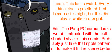 We’ve all seen the comic page with the over-the-top lens flare effect that ruins the atmosphere of the panels around it. It’s easy to get carried away with cool style effects, especially when working digitally. If one of the elements doesn’t match the established style, it stands out even more than a perspective or anatomy mistake. Don’t get me wrong, sometimes things should stand out this way but when an effect brings out something it shouldn’t, the style of the offending object or area has to be knocked back in line. In this example the ripple effect of the holographic computer screen looked too complex for the flat coloring style of the story, so we simplified it to something more appropriate and 2D-looking to better fit with the rest of the story.
- Is everything consistent between panels on a page, and with other pages?
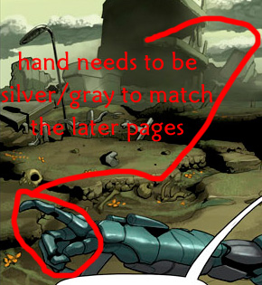 If you can’t tell by now, the one thing I focus on above all else when doing a final review is consistency. For me, I want to make sure mistakes like the one in the example on the right don’t make it into the final draft. Did that building change shape? Did that glove change color? Creating a unified environment makes immersion that much easier and more natural for the reader. When the same thing looks different in two panels on the same page it’s easier to spot, but across pages that can be developed weeks apart are often harder to notice which is why it’s often a good idea to read over a group of pages to make sure nothing very noticeably morphed or drifted over time.
- Are objects, people, and landscape features like plants, buildings, and the sun in the same positions from panel to panel and page to page?
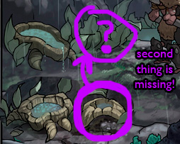 More consistency checking! Colors and shapes aren’t the only things that “drift.” Objects themselves can move around too. I know figuring out things like lighting and tree positions can be a lot of work. Sometimes it feels like you’re making an animation when you concern yourself with with all of this detail. And in a way you are, because our brains create the “animation” between each panel when we read comics. But the more work it is for the reader to do that, the more mentally exhausted they will become over time. Attention to consistency allows the reader to mentally construct the setting of each scene with ease when all of the stationary objects remain stationary.
- Do the line weights all look about right?
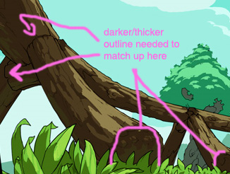 It depends on the style, but at the risk of stating the obvious: most comics have line art, and most comics with line art use lines of different thicknesses and styles. This line thickness is called “line weight.” Generally outlines are thicker and the inner lines forming smaller details are thinner. Artists use these varying thicknesses to make scenes easier to intuitively understand… the thicker the line, the more attention it will attract. I’m no visual artist, but I can at least point out areas where the lines don’t seem right, or don’t match other similar areas. If you’re illustrating your own graphic novel, you’ll probably have an easier time spotting areas where certain lines are either too thick or not as thick as they should be.
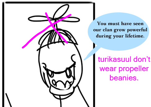
- Is the universe consistent?
This one completely depends on the creative universe you’re writing in. In our world it’s mostly about what’s appropriate for the time period. Are characters using cell phones in 1975? Car phones in 2008? But if you create your own universe then you’ve got an entirely different set of rules to play by, and if you contradict yourself you might have to answer for it later. Of course, some mistakes are easier to spot than others:
That’s the end of my 3-part blog series. I hope you found it helpful! Go catch those novice mistakes!
__________________________
You can see more of Jason Bane’s work at carpechaos.com.
makingcomics.com