Once you have your lines of text set out, it’s time to launch into the final stage of lettering a page: composing your text on the page, and this is where I think hand-lettering shows a great advantage over font or mechanical lettering: flexibility.
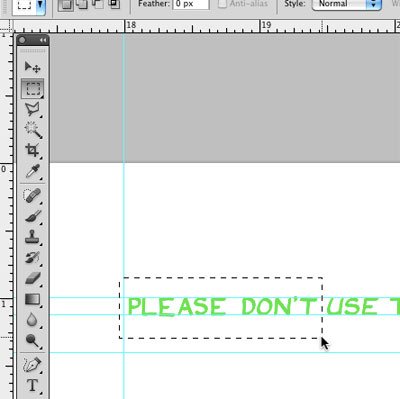
Assembling your text from a single long line into blocks can be done with just the marquee and lasso tools, and you can space your words and letters visually with much greater speed and visual accuracy than can be easily accomplished with the leading and kerning functions in the text tool: you just select the text and put it where you want it.
Here, again, it’s good to go over a few rules of thumb for lettering. First, you want to make sure the text fits in your composition properly, without obscuring any crucial visual elements. Normally, I like to plan out my dialogue with this in mind, to ensure that I have enough “dead” or otherwise non-crucial space in each panel to support the level of dialogue I want to put in it. Even so, by altering the spacing of words and letters you can often alter the size of your dialogue blocks on the fly to make up for this somewhat. One thing I do not recommend doing is dynamically resizing your text beyond about 5% of its original size – it’ll start to look fuzzy, and it’s generally best to letter at a larger size rather than scaling your letters. Note also that you should arrange your blocks of dialogue to avoid leaving single words on a starting or ending line if at all possible – these are called orphans and widows, and can make the balloon hard to read. Some schools of thought say that there should NEVER be widows or orphans in comic dialogue, but I tend to be a little more lenient, since with three-word sentences and phrases, you may sometimes be unable to avoid it. In general, I find that you can sometimes get away with it so long as the general shape of the block is roughly rectangular (that is, if the orphaned or widowed word is longer, and the two succeeding or preceding words together roughly equal its length). If not, it’s better to either rewrite the line of dialogue, or arrange it as a single line instead of two. A lot of this depends on visual acuity on your part – if it “looks right,” I usually go with it, regardless of the technical rule.
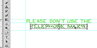
Regarding typeface styles, dynamic sizing and selection makes adding style variants such as italics and boldface very easy, if done in moderation. I should point out, of course, that the best practice is usually to construct bold and italic letters from the start, but often I find myself up against a crunch and so there are a few shortcuts that can speed up the process. Italics can be added with the Edit/Transform/Skew function – just set the angle you want and hit Return. Be careful, though, and make sure that you don’t incline the italics more than about 10 degrees at the most, or the letters will lose their proportions and begin to look compressed and squashed along the horizontal axis. To counteract this, once you have the angle you want, you can clean up the lines with a second go with your lettering brush, to make sure the strokes all stay in a good proportion. If they start to run together or the letters get hard to read, you’ve probably overdone it, and you should start over with that word or phrase – readability is the key, here.
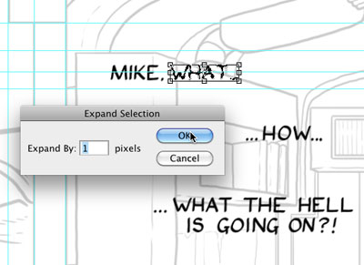
Boldface has a similar shortcut. Again, the best way to go about constructing boldface letters is to actually use a bolder pen, but there’s also “quick-and-dirty” method I frequently use to save time, and which works pretty well for hand-lettered work. First, select the text you want to put in boldface, and then set the selection to map to the edges of your text; the easiest way to do this is just to nudge it back and forth. Use the arrow keys with the “Move” tool selected, and the marquee will automatically snap to the edges of your text lines (provided you remembered to letter on a separate, transparent layer). Then, use the Select/Modify/Expand to add extra edge to the letters you have selected, and the Fill them with the base text color (Option-Delete or Alt-Delete is the standard keyboard shortcut to fill with the foreground color). Be sure not to expand more than one or two pixels or the letters might start to run together – if you know you want a heavy boldface on a certain word, allow a little extra spacing between your letters when you construct them, and always be conservative with boldfacing like this, as too much will ruin your letters’ proportion and make them hard to read.
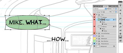
Finally, you need to build your word balloons. This is the essential mainstay of comic art, and is the basic icon of speech in a static art form like this. Word balloons can have any shape at all, from pure ellipses to more natural shapes, to rectangles and other machine-like looks, and the shape will define the way the readers “hear” the words in their heads as they read. There are as many ways to go about making word balloons as there are styles of lettering. This can be done with strokes, by drawing your own outlines freehand, or even with the Pen Tool. But for simplicity, I’m just going to go over the technique I use most frequently, and which I have found gives me the quickest, most satisfactory result.
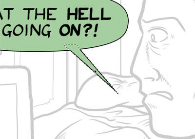
Normally, I start by setting up my balloons as “shape layers,” usually just ellipses that are of suitable size to contain my letters with a comfortable margin. Drawing my word balloons freehand always seems to leave me with lopsided ones, and I prefer the uniformity and clean edge I get from forming them on shape layers. I start by making my ellipses with no edge stroke and a solid fill color. In my comics, I use different colors for each character’s speech, but you could just as easily make this color white; it should have a fill color, though, to blot out the background and make the speech balloon read clearly on top of the scene. However, the ellipse or oval tool usually makes for an odd-looking shape, especially for one-line text, and so I use the Edit/Transform/Warp command to bring up the control and contour points for each one, which I use to add more space to the ends of the ellipse, and give them more of a pleasing curve. When I’ve done this, I rasterize all the shape layers I’ve made for the various balloons, and flatten them to a single “word balloons” layer, which I place underneath my text layer; I then touch up the alignment of the dialogue inside the balloons. Finally, to the Word Balloons layer, I add a Layer Effect: Stroke, which I usually set to “3 px” width, and “Inside” alignment. This makes for a nice, smooth line along the edge of all the word balloons. Then I finish up with the speech tails, which I draw in just using the polygonal lasso tool, and fill with the proper color to connect them to the word balloon.
So there it is: with all that, you should have a nice, clean, hand-lettered page, done entirely in a computer! It may seem complicated the first few times you do it, but in the end, the result is well worth the effort, and with a little practice and patience, I think you will find it a fast, clean, and very pleasing alternative to lettering with predesigned fonts.
______________
HAND LETTERING A DIGITAL COMIC PART 1
HAND LETTERING A DIGITAL COMIC PART 2
HAND LETTERING A DIGITAL COMIC PART 3
See Mathieu’s webcomic and blog here: www.viciousprint.com/6commando
makingcomics.com
No links to the first 2 parts? SMH.
Ask and ye shall receive.