Posts Tagged: Underdog

Nondestructive Photoshop Shadows and Effects

Efficiency. As comic creators, we’re all striving for it. With full-time jobs, family, and everything else life throws at us competing for our precious art time, being more efficient means getting more done. My goal with these Photoshop articles is to help you streamline your process to get more work done in the same amount of time – or even less. I began with an article on using Photoshop Actions in your workflow. Today, I want to talk about using some of the more powerful features of a world class application like Photoshop. Specifically, creating shadows and effects nondestructively. But what is nondestructive editing? Let’s have Adobe explain it:

Nondestructive editing allows you to make changes to an image without overwriting the original image data, which remains available in case you want to revert to it. Because nondestructive editing doesn’t remove data from an image, the image quality doesn’t degrade when you make edits.

(more…)

WRITING TROPES: EXPOSITORY DEVICES

Tropes are storytelling devices. Used well, they enrich a story; used badly, they result in the dreaded cliché. This series of articles takes a closer look at some major tropes relevant to comics and the pitfalls they may present.

Exposition

“Exposition is a literary tool that is used to give information to the audience through dialogue, description, flashback or narrative.” Source: tvtropes.org

(more…)

Comic Review Checklist Part 1: The Flow

Hi everyone! For my first articles I’ll be sharing my comic review checklist. It has three parts: everything that relates to the “flow” of the pages, everything that relates to the words on the pages, and then everything else. This is part one! (more…)

Self-Publishing Tips: Offset Printing, Part 2

Continued from part 1, which covered resolution, color space, page size and position.

Number of pages:

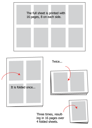
While diversification of printing techniques means this is no longer always an issue, it remains an issue to be aware of when using offset printing. I am talking about the fact that the number of pages in a book needs to be a multiple of 16. This is due to the way offset printing, which makes use of large plates, works:

16p

(more…)

Easy Text Effects in Photoshop

This short video tutorial explains how to create quick, professional looking text sound effects using Photoshop. What’s more, the effect is non-destructive, meaning it uses layer styles on active text (not rasterized text) so you can change the word, change the look and even save it as a style to apply to other text. This is the way I do a majority of text effects on my comic Marooned.

(more…)

Hand Lettering A Digital Comic, Part 3

Once you have your lines of text set out, it’s time to launch into the final stage of lettering a page: composing your text on the page, and this is where I think hand-lettering shows a great advantage over font or mechanical lettering: flexibility.

(more…)

The Flow Of A Page, Part 2

Gutters and Borders: Where The Action Really Happens

So, here it is, the second installment in my series on ‘The Flow Of A Page.’  Last time we broke it down with panel layouts, both grid and free-form, and talked about ‘The Big Z,’ that is, bouncing the reader’s eye exactly where you want it to go across the page.  This is a medium that should strive for, above all other things, clarity.  You as the artist/writer/creator are trying to convey a message (story) that should be able to be digested by the reader without confusion or chaos.  That’s not to say confusion and chaos can’t be used as effective elements as well, but that’s for another post.  You’ve already learned some rudiments on panel layout, so now we will move on to the construction of panels, and that all-important space in between them, the gutter.

(more…)

I’ve Been Framed! – Framing Comic Panels

Panels are a vital part of a comic page. Without panels, virtually every page of a comic would be a splash page, and comics would essentially be storybooks. Many creators tend to frame each panel inside a border, but this doesn’t always have to be the case. Let’s take a look at a page that has 5 panels, each with a border.

1

(more…)

Hand Lettering a Digital Comic, Part 2

With all your settings together, the process of lettering mainly becomes a matter of good form.  This applies as much to lettering with pen and paper as it does to the digital medium, but digital formatting amplifies the issues of good form because the feedback from a tablet and stylus is much different from what you get from pen and paper.  In short, the tablet produces the tendency for lines to wobble, because the pen can tend to slip.  This is particularly likely to happen if you aren’t using a properly controlled hand posture while you letter.  (See why I was so specific in the first part?)

(more…)